If you’re like me, you probably have tons of photo-filter apps on your iPhone. So many in fact, that you have enough filter combinations to last you a lifetime. So why would you look for more filter apps!? Well, I was bored, and I came across Tiffen’s Photo fx app. Some of you may be familiar with Tiffen’s line of optical filters for DSLR’s and other cameras. Tiffen created this app with their heritage in optical filters in mind. As I read through the list of filters in the app, it was like having a bag of these filters at my finger tips! To make things even better, the filters could be stacked, tweaked, and masked! I was sold!
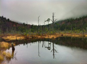
I browsed my photo stream looking for a photo to put this app through it’s paces. I decided on a photo that I took very recently on a gray day as I was hiking through the White Mountains in New Hampshire. This photo is an HDR (High Dynamic Range) of one of the Greeley Ponds. I picked this photo because of the huge expanses of gray in the water and sky. Here is the original:

Gray day at Greeley Ponds.
I like this photo and I took it specifically with the a conversion to black and white in mind. But after browsing through the filters in this app, I knew that I could punch it up a bit. I made a few tweaks in Snapseed, like contrast, saturation and cropping. Yes, I like to crop in Snapseed. Then I brought the photo into one of my other favorite (new to me) apps, Perfectly Clear. After that app worked it’s magic, I was left with this image:

A bit better, but still gray.
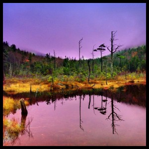
Perfectly Clear really punched up the contrast and saturation, and got rid of some of the diffusion from the fog. It also brightened up the sky and the water, which is exactly what I wanted before applying a filter from Photo fx. Once I uploaded my photo into this app, I opened up the Grads/Tints filter folder, and then opened the Sunset/Twilight folder. For this photo I picked the Twilight 2 filter. At first glance, the photo looked really cool, but the colors were a bit too saturated. No problem though, the app lets you dial back each of the primary colors found in the filter, in this case, blue, purple and red. I made my tweaks and things were starting to look better, but I wasn’t happy about the filter being applied like a blanket over the entire image. No problem again! Tapping the paint brush icon on the bottom of the screen revealed the masking feature. Using my finger, I was able to mask out the grass and trees, effectively eliminating the filter from those areas. I feel that this gave the image a slightly more realistic feel. From there, I brought the photo into PicFrame and added the black frame and then posted to Instagram. Here is the final image:

Not very gray anymore!
What do you think? I’m excited about the control this app offers and the realistic filters. If this app looks like something that might interest you, we’d love to see your creations! Post them up on Tiny Shutter’s Facebook page or maybe our new Twitter page! This app is $2.99, but I feel it is worth every penny. So if your tired of filter apps that only seem to be able to make your photos look “retro”, this might the app you’re looking for!
Matt
